An example....
In the PSP browser, up top, click on FILE / NEW.
In the "New Image" box, make the width and the height what you want. If you are just making your name, a good size would be 4W x 2H in inches, but you can make it anything.
If you are going to be applying a drop shadow to the text (inst. for that explained later), then make the new image an inch bigger all around.
Unless you know about pixels, put 'inches' in the box next to the width and height.
The 'Resolution' box should be 100.000, and "pixels/inch" should be next to that.
The 'Background Color' is best white.
'Image Type' should be 16.7 million colors (24 bit).
Now OK the box.
Make sure everything is showing. For example, the Toggle Tool Palette should be on the left hand side, unless somehow it got moved. It's the side tool bar with all the icons on it. If it's not visible at all, then up top, click on the icon that looks like this: 
Then at the right side, you will see these 4 boxes that look like this: 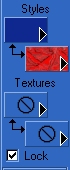 , except yours will have a differerent color and pattern in them. If you don't see them, then up top, click on the "Toggle Color Palette", which looks like this:
  . It's next to the Toggle Tool Palette.
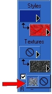
We will just work with the top 2 style boxes, not the ones on the bottom called "textures". So if the bottom 2 texture boxes aren't locked already...lock them.
Do so by clicking and holding your mouse in the texture box. Don't do a full click, but click and hold the mouse in it until a little pictoral menu pops up right below it until you see what looks like what my arrow here is pointing to:
Click on the little circle with the line through it. That will lock it. Do this with both bottom Texture boxes.
So now we are ready to work with the top 2 Style boxes.
The first one is the foreground color, and the second one is the background pattern. That's what makes all the fancy fills.
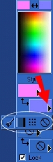
Make sure the second one has ANY pattern in it. If it doesn't, then click and hold your mouse in that color box until the little pictoral menu pops up right below it. Click on the picture that looks like a domino or dots. Below is a screen shot of the style boxes. What the red arrow is pointing to is the box that you click on and hold. The pic that is circled in white is the little menu that should pop up below it.
So after the little domino thingy in the menu is picked, now click on the pattern in that box and a little window will open up in the middle of the screen.
Click on the pattern that's showing and a bunch more patterns will appear.
Scroll within that and click once on one you would like to be used as your text fill.
It will now be in the little pattern window by itself, so now click OK at that box.
You will now see it as the choice in the second style box to the right of your screen.
Or you can use a background from your own files.
To do that, just open up a background from your files you want to use, then minimize it.
Then click in the background fill box and click on the background showing.
Then scroll all the way to the top and you will see your bck. pattern you just opened up from your files.
Click once on it, and it will now be in the little pattern window by itself, so now click OK at that box.
You will now see it as the choice in the second style box to the right of your screen.
Now, in the first box, the foreground color, make sure a solid color is in that box.
If it's not, then click in it until the pictoral box pops up below it.
Choose the icon that looks like a paintbrush.
Now click on it and the color box will appear.
Click on a color you would like to be the outline of your text...one that will compliment the pattern preferably.
Once you click on a color, you can be more specific in the larger rainbow box or ring.
Now OK that box.
So now at the toggle tool palette at the left of your screen, click on the letter 'A' icon. It's near the bottom. It's the text icon.
Put your cursor near the middle of the blank new image box and click once.
The "Text Entry" box will appear.
For this example, let's do your name...so type in your name.
Now highlight your name so you can change it's style and size.
Or you can right click in the text entry box and choose to 'select all' to highlight.
Now click on the dropdown arrows in the name and size box to change these.
You can also choose to have it bold or not.
I would choose the center text icon.
I would pick a font size that's wide so the pattern fill shows up good, but that's just preference.
If you chose 4W x 2H or larger for your new image, then choose "72" for the font size.
Leave the 'kerning' and 'leading' both at "0".
For this, it doesn't matter if "auto kern" is checked or not.
Under the "create as", have VECTOR and ANTIALIAS checked.
Now OK the box.
Your text will now be in the new image box and it will be 'boxed' with nodes.
Those nodes are for dragging your text to size if you want to.
If you do that, then after, click on "Effects / Sharpen / Sharpen".
But it's best to just click on "Edit / Undo Text" and choose a different size than to drag to size. But if you want the size bigger than 72, or what you want is in between sizes, you will have to drag to size. Just be sure to sharpen if after.
You should also center the text on the page.
Do so by putting your cursor over the middle node in your text until the four sided arrow shows up.
Then you can drag your text to center it in the box.
If the text entry box shows up instead, you dragged before the cursor became the four sided arrow, so just cancel that box and try again.
Or you could just click on the "mover" icon, which is the 5th icon down at the left.
You can center your text this way too, if you grab onto the right spot in the text.
So now you have a fancy text with a fill and can now save it.
You may need to crop out too much background area first, if there is indeed too much.
Just click on the "Crop" icon, which is the 4th one down at the left.
Now just drag the crop box around the text.
If you goof, just right click once in the box to erase and start over.
Double click in the middle of your cropped section and it will crop.
To save, instead of clicking on "File / Save As", do this...
Click on FILE / EXPORT / JPEG OPTIMIZER.
Set the compression value to "1" for the best quality if this text is going to go on a printable.
If it's just for a sig tag for email, I would set the compression value to 20.
Now click on OK and save it to your folder of choice.
OPTIONAL:
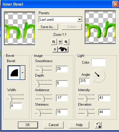
You can add an inner bevel to make it look 3D. To do so, click on "Layers/ Convert to Raster Layer", then click on EFFECTS / 3D EFFECTS / INNER BEVEL. You can play with these features here, including clicking on the picture in the little bevel box for different bevel looks, and also the color box. OK the box when done.
Below is a screen shot of the most common inner bevel I use. Change your settings to this to see if you like the look.
You can also add a drop shadow to your text. It's best to do that after you bevel it, if you do bevel it.
To do so, first click "Layers/ Convert to Raster Layer", if you haven't already and then click on EFFECTS / 3D EFFECTS / DROP SHADOW. You can play with these settings and also change the color of the shadow in the color box here.
The standard default settings for the drop shadow box are this:
Offset: 10 for both vertical and horizontal.
Attributes: 50 for opacity, and 5 for blur.
The color in the color box is black.
If it's not, you just click on the color and the color box will appear to put black there.
If you ever forget the standard settings, just click on the reset button in the drop shadow box.
It is the icon next to the help button. Most features have the reset button.
So try the standard settings for this example to see how you like the look.
There is a preview in the little window.
Click OK at the box.
If you don't like this, click on EDIT / UNDO DROP SHADOW or undo whatever you want to undo.
Personally, I like the opacity set at 75, and the blur at 50 for most things.
If you do like it, save it by doing the FILE / EXPORT / JPEG OPTIMIZER thing.
If you do apply a drop shadow and you also want to crop the text to get rid of too much white area, be careful of where the drop shadow is. If you cut any of it off, the shadow area will look choppy instead of shadowed.
Hope you found this tutorial useful! Please do not pass my tutorials around. Instead, give a link to this site.
~Summer °Ü°